Illustration Friday - 'Opposites'
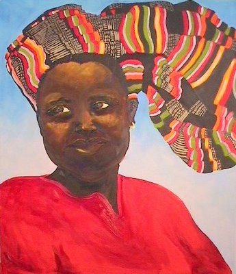
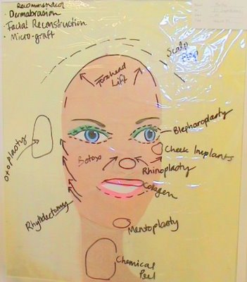
The theme for IF this week is opposites. I did a whole series on this at uni comparing life in the western world with life in Africa. This was a pair I did on beauty. Needless to say, my lecturers didn't like the paintings at all. They said the African image was too steriotyped. My aim was to show the obsession we have with improving ourselves even if we are perfect and compare it to the natural beauty that I saw in Africa.


7 Comments:
Terrific! I agree with you whole heartedly!
I love the picture of the African lady. It's beautiful.
The African woman is the true beauty.
This makes a great commentary, and I really admire the beautiful portrait of the African woman. She looks so full of joy and so comfortable as herself. The colorful fabric in the background is nicely rendered. I like this a lot!
Thanks for all your comments, glad you liked the paintings.
The African woman is a stereotype but so is the plastic surgery candidate so this piece works really well. I love it.
I think that we can't create with everyone's opinion in mind, and so your opinion is as valid as your critics. Stereotype? OK, if they say so, but great intent shines through and gets that message loud and clear. Great interpretation!
Post a Comment
<< Home